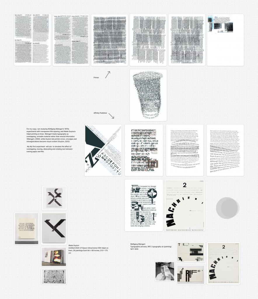
This project investigated how tools and process conditions generate unintended outcomes in graphic design, and how such outcomes can be examined through rigorous, systematic and sustained practical inquiry. Week one examined Wade Guyton’s Untitled 2020–21 and Wolfgang Weingart’s Typographic Process, then recreated Weingart’s NR 5 in Affinity. The software’s negative-space logic produced minor deviations, and printing shifted white to grey-green and black to dark green. Controlled tests with different printers, colour modes/transparency and papers confirmed that these variables affected results, establishing the project’s central concern: the unpredictable agency of tools. This iterative replication and variation aligns with procedural exercises (Queneau, 1998), where constrained repetition exposes difference rather than mere copying.
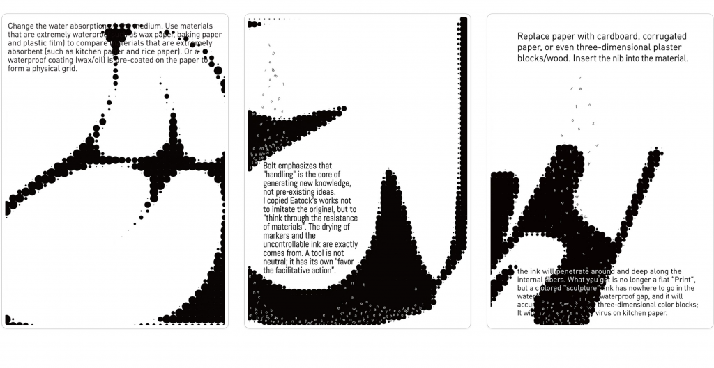
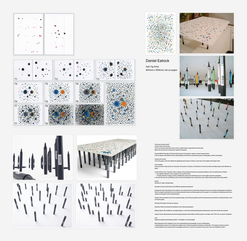
Week two, drawing on ‘The Magic is in the Handling’ (Bolt, 2019), examined inkjet printing as material handling. The printer’s minute syringes resemble screen-printing logic. A replication of Daniel Eatock’s Felt-tip print controlled time, pressure and material across seven papers, varied pressures and dwell times from 30 seconds to 72 hours; both pressure and time affected outcomes to differing degrees. This stage shifted attention from visual result to rule-bound process, resonating with Conditional Design’s emphasis on conditions and instructions (Maurer et al. 2013) and with ad hoc improvisation within systems (Jencks and Silver 2013).
Week three focused on Xavier Antin’s Printing at Home. Antin’s deliberate sabotage of printers prompted a methodological shift: instead of observing tool effects, I intentionally disrupted printing to interrogate standard workflows. Three experiments were conducted:
(1) three printers printed the same image on different papers under a unified process;
(2) one printer used different inks and papers;
(3) one image was separated into four colour layers and printed with different cartridges on the same paper.
Each involved random ‘destruction’ of ink, cartridge or nozzle—coffee as ink, apple or lemon coatings, and potato stamps. Contrary to expectation, controlled variables still produced unforeseen results.
Experiment 1 showed no anticipated smudging, owing to quick-drying ink and smooth paper, with only peripheral droplets.
Experiment 2 showed that potato starch affected printing, but drying potatoes transferred water and starch, altering paper humidity and hardness more than smoothness; later starch absorbed water and drew ink into wet paper, causing smudging.
Experiment 3 showed complete disruption of the printer’s workflow in its middle and late stages.
These findings generated further questions about humidity and ink adhesion, stamp pressure and mechanical misplacement, and the precise point of process breakdown. Research into Antin revealed that his Industrial Revolution imagery deliberately links printer technology to labour displacement, Luddite machine-breaking and the subversion of standardised products. This parallel between intentional sabotage and historical resistance to automation became the project’s conceptual pillar, connecting week one’s tool-generated unpredictability, week two’s handling-based control tests and week three’s disruptive printing.
Ultimately, the project demonstrates that critical research in graphic design can be developed through rigorous, systematic and sustained exploration of materials, rules, errors and historical contexts (Bolt, 2019).
Reference List
Bolt, B. (2019) ‘The Magic is in the Handling’, in Practice as Research: Approaches to Creative Arts Enquiry.
Eatock, D. (n.d.) Rolling Pin Paintings and Felt-Tip Prints.
Jencks, C. and Silver, N. (2013) Adhocism: The Case for Improvisation. Cambridge, MA: MIT Press.
Maurer, L., Paulus, E., Puckey, J. and Wouters, R. (2013) ‘Conditional Design Manifesto’, in Conditional Design Workbook. Amsterdam: Valiz.
Queneau, R. (1998) Exercises in Style. Translated by Barbara Wright. New York: New Directions.
At the beginning of this project, I studied Wade Guyton’s [Untitled 2020–21 Epson Ultra Chrome HDX Inkjet on Linen, 26 Paintings each 84× 69 inches; 213 × 175 cm] and Wolfgang Weingart’s [Typographic Process], I found that I was interested in the “unexpected” effect caused by a tool. Earlier in the first week, I chose to redo Wolfgang Weingart [typographic process, NR 5. typography as (painting) 1971-1974] with ——Affinity, a software I had never touched before. I found that it was actually similar to Adobe. It’s just that when making the negative space of the replica, it’s different from Adobe’s logic of drawing graphics directly. It needs to overlap two graphics and cut off the non-overlapping parts to meet the plastic requirements, which leads to the replica being slightly different from the original in some details. Then I printed out my copy later in the first week. I found that the white background displayed on the computer would turn gray-green after printing, and the black font would turn dark green again. According to this problem, I set up a set of control experiments:
Experiment 1 printed the same document with different printers.
Experiment 2 sets different transparency and color modes but prints with the same printer.
Experiment 3 ensures the consistency of file settings and printers, and uses different materials of paper for printing.
Finally, it is known that these three variables have changed the results. At the end of the first week, I finally realized that what I was really interested in was the unpredictable influence of tools on graphic design.
At the beginning of the second week, I studied Barbara Bolt from the reading list. His theory of “The Magic is in the Handling” coincided with my research direction. I began to study the working principle of printers, and I began to conceive how to make printers work by themselves. I was curious about the results. When I began to study the working principle of inkjet printer, I found that its interior is like many tiny syringes. Normal printing can be realized by controlling the amount and color of ink flowing through the syringes. I think this is very similar to the principle of screen printing, which is to control the ink to flow through tiny holes to leave the desired graphics on the paper. According to this idea, I found Daniel Eatock in the recommendation list, and his work [Felt-tip print 841 mm x 594 mm, ink on paper] inspired me a lot, and I made a copy of it. My replica follows the principle of controlling three different variables-time, pressure and material. Similarly, I also set up a set of control experiments:My replica follows the principle of controlling three different variables-time, pressure and material. In the same way, I also set up a set of control experiments:
Experiment 1 uses seven kinds of paper with different materials to contact the pen tip under the condition of ensuring the same contact time and pressure between each material and the pen.
Experiment 2 different pressures (such as a book, a ceramic cup and a mobile phone case) were applied to the back of the paper under the condition of ensuring the same material of the paper and the same contact time between the paper and the pen.
Experiment 3 the paper was allowed to stay for 30 seconds, 1 minute, 1 hour, 12 hours and 72 hours respectively under the condition of keeping the pressure and paper material unchanged.
The final conclusion is consistent with my original guess:both have influence and varying degrees.
In the third week, I came into contact with the artist Xavier Antin, whose early work [Printing at Home] brought me new inspiration on the road of iteration, and I began to try to deliberately destroy the printer to make a copy of Printing at Home. Like last two weeks, I set up my experiment:
Experiment 1 uses three different printers to print the same picture on different materials of paper according to the unified process.
Experiment 2 uses the same printer to load different inks for different papers to print the same picture.
Experiment 3 the same picture was divided into four different layers according to the color of the printer’s ink cartridges, and the same picture was printed with the same paper for different ink cartridges. In the above experiment, I will randomly “destroy” any ink/cartridge/nozzle (for example, replacing ink with coffee liquid/coating nozzle with apples or lemons/stamping paper with cut potatoes).
The result was unexpected: under the condition that I controlled the variables, the unchangeable things also brought me unexpected results. So I began to explore the effects of those tools when they worked by themselves. In the process, I recorded the following questions and set up experimental groups for them one by one:
How does the humidity of paper affect the ink adhesion?
Will the pressure of potato stamp cause paper jam or misplacement of print head?
In which part of the printer’s standard process was completely disrupted?
Before doing the experiment, I made some guesses based on the experimental results of the questions I was interested in: First, I guess that when the paper is wetter, the hardness of the paper will decrease, and the adhesion ability of ink will increase, so the printed picture may produce uncontrollable ink smudge with the superposition of layers. Secondly, I guess that potatoes, as a starch-rich medium, should have a great influence on the smoothness of paper after being cut as a seal, so the printed pictures will be uneven and many places can’t be inked. Finally, I guess there will be an accident in the middle and early stage of printing, which will make the printer unable to complete the printing work according to the normal process. But the display of the results opened my eyes.
The result of Experiment 1 showed that the ink didn’t smudge as I expected, which may be because the ink itself has the property of quick drying and the printing result is surprisingly perfect because of the high smoothness of the paper, and only a small number of ink droplets splash on the periphery of the main image.
The results of experiment 2 show that the existence of starch in potatoes really affects the printing effect of pictures, but because the cut potatoes will also dry with the passage of time, the initial seal will only leave most of the water and a small part of starch on the paper, which will change more the humidity and hardness of the paper than the smoothness. Then, as the potato incision dries, more and more starch is stacked on the paper. The humidity of the lower paper is too high, and the starch on the upper layer becomes dry and has strong water absorption, so that the ink is quickly introduced into the wet paper after passing through the starch, but the effect is similar to the result of Experiment 1, as I guess-the image is smudged and spread out.
The results of experiment 3 can be judged by the results of the above two experiments and the printing effect of the final picture. The result is that the printer was completely disrupted in the middle and late stage of the workflow.
Through my in-depth research into Xavier Antin, I discovered that the imagery he employs in his Printing at Home series—drawn from the era of the Industrial Revolution—was not chosen at random. I believe Antin intentionally links these visuals to the technical nature of the printer itself and to metaphors concerning the displacement of human labor. Many of the images he selects depict the Industrial Revolution—a period when the automation of looms allowed even low-skilled workers to operate machinery, a shift that, as historical records show, incited the Luddites to protest by smashing the machines. I interpret Antin’s decision to present these historical images—layered and stacked through the printing process—as a gesture that implies the disruption and subversion of standardized technological products. By drawing a parallel between this “intentional sabotage” of the printer and the historical resistance of workers against automation, Antin not only explores the impact of technological change on social structures but also unearths an overlooked technological lineage, while offering a critical examination of what automation signifies for labor. This insight has proven to be the most valuable takeaway from my research into his work, and it now serves as a core conceptual pillar for my own project in its current iteration.
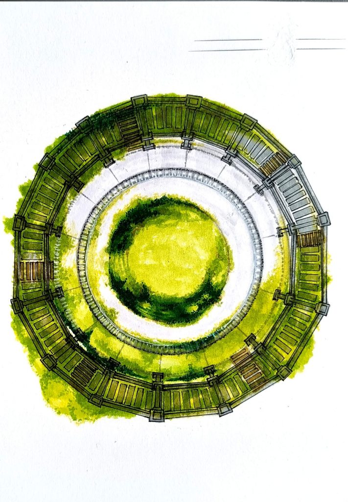
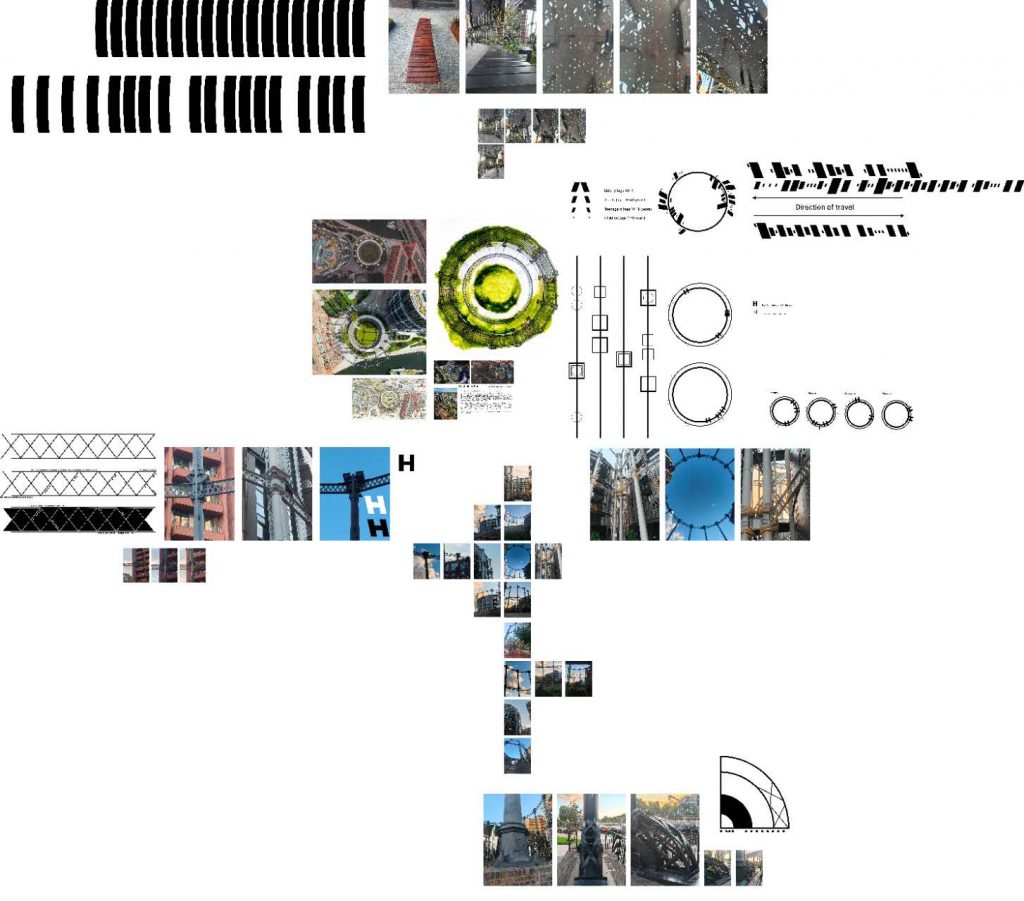
The survey critically evaluates how the reconstructed infrastructure affects human behavior by transforming tourists’ time and physical traces such as age, direction, duration and group composition into a geometric visual language system derived from the industrial buildings in the site. As a systematic and creative method, it explores and records the spatial dynamics of Gasholder Park in London.
Thematically, this study is based on Perec’s concept of “extraordinary”. Perec (1974) believes that streets and blocks are not passive backgrounds, but positive factors in daily life and production, which requires a thorough and almost compulsory observation of the secular. Gasholder Park, as a relic of industrial infrastructure, perfectly embodies the dialectical relationship between historical practicality and contemporary leisure. After completing the survey, I extracted architectural patterns, grids, structures, materials, and digitized human daily behaviors. By drawing these microscopic things, the survey critically evaluated how an industrial “container” was redefined by the time rhythm of its current users. Perec believes that in order to truly understand a place, it is necessary to systematically record the humble and invisible habits of residents (1974, pp. 42–45). Based on this, I used words and dialectograms illustrations to record the duration of people’s loitering in a specific period of time, the sounds generated and the regular behavior of the group, which formed my reflection on Perec’s strict inventory of daily life.
In terms of process, my practice is deeply influenced by Agnès Varda’s documentary methodology of “collection”. In “gleaner and Me”, Varda observes and collects discarded items, neglected details and human traces, and turns short life into tangible archives. Similarly, my process includes “collecting” the spatial behavior of tourists in Gasholder Park. I abstract complex social interaction into geometric repetition (group formation) and linear vector (motion direction). This process should investigate and critically evaluate what has been lost and gained in this abstraction. Just as Varda’s lens re-textualizes the neglected things (Agnès Varda, 2000), in this note, I show that the coding of spatial rhythm system is not only recording, but also actively constructing a new way of “watching” places. It transforms the transient nature of human interaction into an important and methodological file.
Conclusion
By combining Perec’s obsession with unconventional themes and Varda’s process innovation in collecting neglected traces, this study puts forward a strict methodological framework. Visual language system is not only an exquisite performance result, but also a close and key tool to ask about urban spatiality. It proves that the systematic abstraction of human behavior can reveal the hidden social spatial structure, and finally position graphic design as a powerful spatial critical model.
Reference List
Perec, G. (1974) Species of Spaces and Other Pieces. Penguin Books.
The Gleaners and I (2000) Directed by A. Varda. [Documentary film]. Ciné-Tamaris.